Colors That Go With Burnt Orange: The Ultimate Guide
Burnt orange is a rich, earthy hue that brings warmth and personality to a space. It’s bold yet cozy — perfect for creating inviting rooms.
In this updated color guide, you’ll find palettes that work beautifully with burnt orange — from timeless neutrals to vibrant contrasts and jewel-tone pairings.
Why Pairing Matters
Choosing the right companion colors helps balance burnt orange’s warmth. Some make it pop, others soften it.
Knowing how each combo feels (warm, cool, calm, bold) lets you design with intention.
This post may contain affiliate links, which means I’ll receive a commission if you purchase through my links, at no extra cost to you. Please read full disclosure for more information.
Best Colors to Pair With Burnt Orange
Neutral Favorites
These neutrals let burnt orange shine without overwhelming your space:
- Beige – soft, classic backdrop that warms with burnt orange.
- White – crisp and modern, creates clean contrast.
- Cream – warmer than white for a cozy feel.
- Charcoal Gray – adds modern depth and sophistication.
Warm and Earthy Color Pairings
These colors enhance burnt orange’s natural warmth:
- Mustard Yellow – vibrant and autumnal.
- Brown (light or dark) – timeless and rich.
- Copper/Metallics – brings in texture and shine.
Cool Colors for Balance
Using cool hues creates contrast and visual interest:
- Navy Blue – classic contrast that feels grounded.
- Emerald/Forest Green – rich and earthy for nature-inspired designs.
- Sage Green – softer, calming green that complements burnt orange beautifully.
- Mint Green – lighter, playful contrast.
Burnt Orange & Beige
Beige is one of the easiest colors to pair with burnt orange. It softens the boldness and keeps the space feeling calm and balanced.
This combo works especially well in living rooms and bedrooms where you want warmth without heaviness.
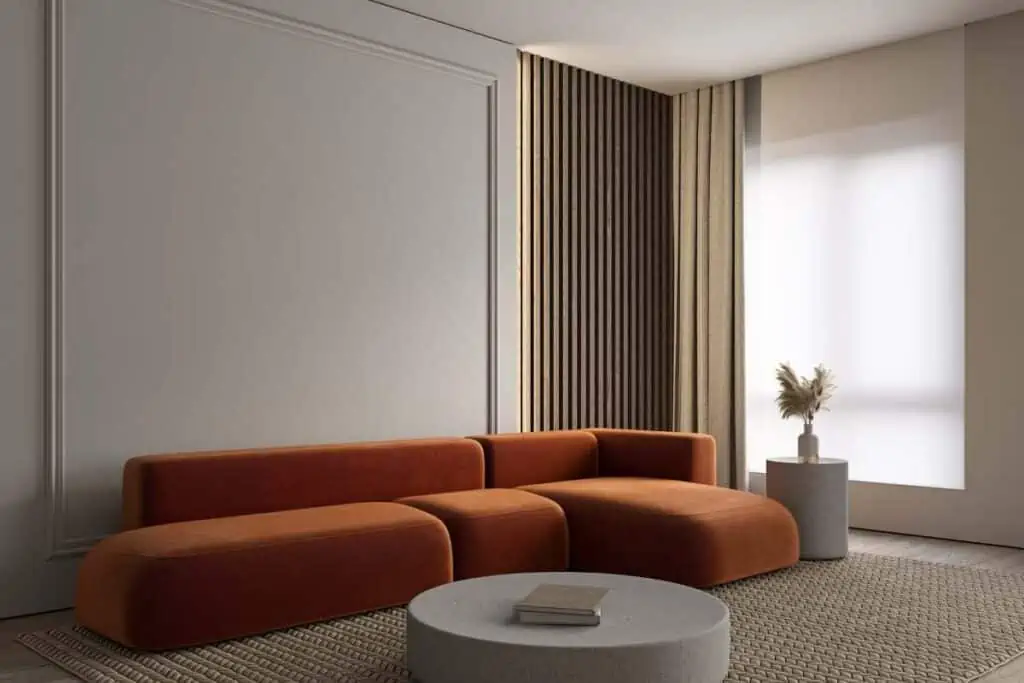
Why it works
- Grounds burnt orange without dulling it
- Feels cozy, timeless, and flexible
- Easy to layer with wood and natural textures
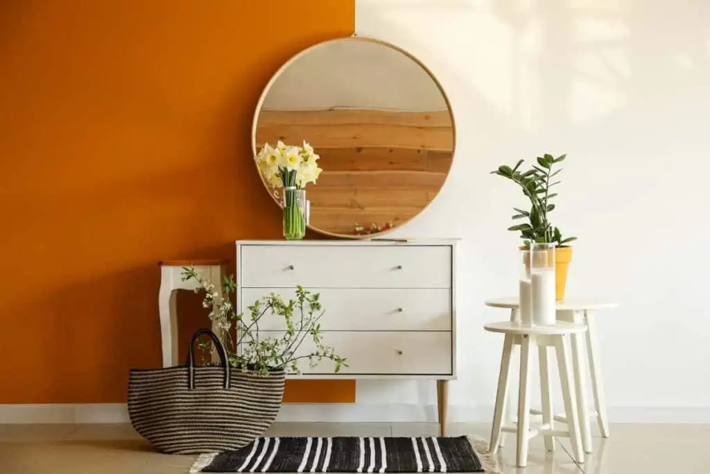
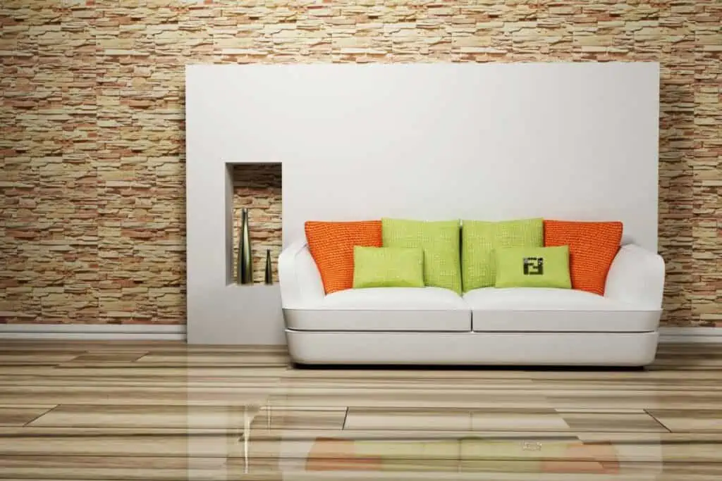
Burnt Orange & White
White creates a crisp contrast that keeps burnt orange from feeling too heavy or dated.
This pairing works best when burnt orange is used as an accent rather than the main color.
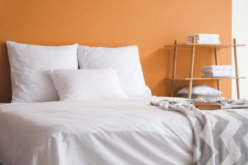
Why it works
- Ideal for smaller rooms or low-light spaces
- Brightens the space instantly
- Makes burnt orange feel fresh and modern
Burnt Orange & Cream
Cream offers the warmth of beige with a softer, more elevated feel.
It’s perfect if you want a cozy look that still feels light and inviting.
Why it works
- Works beautifully with farmhouse and traditional styles
- Warmer and softer than bright white
- Creates a layered, relaxed palette
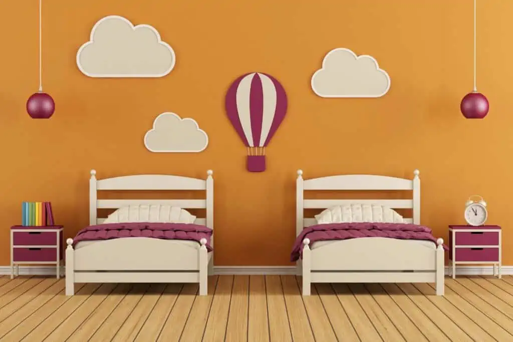
Burnt Orange & Dark Pink
Dark pink (or muted rose) adds a playful but sophisticated contrast to burnt orange.
The key is keeping both shades muted so the combo feels intentional, not loud.
Why it works
- Great for accent decor and textiles
- Adds depth without overpowering
- Feels trendy but still livable
Related: Colors That Go With Pink
Burnt Orange & Mustard Yellow
This is a bold, warm pairing that leans heavily into earthy and retro vibes.
Use one color as the star and the other as a supporting accent to avoid visual overload.

Why it works
- Perfect for fall-inspired spaces
- Both colors share warm undertones
- Feels cozy, cheerful, and creative
Burnt Orange & Navy Blue
Navy blue adds contrast and structure to burnt orange’s warmth.
This combination feels classic and works well in both modern and traditional homes.
Why it works
- Easy to style year-round
- Balances warm and cool tones
- Adds depth and sophistication
Burnt Orange & Mint Green
Mint green brings a light, refreshing contrast to burnt orange.
This combo works best when mint is subtle and not overly bright.
Why it works
- Best used in small doses
- Prevents burnt orange from feeling heavy
- Adds a soft, unexpected contrast
Burnt Orange & Copper
Copper enhances burnt orange by echoing its warmth and richness.
This pairing works beautifully through finishes rather than paint.

Why it works
- Perfect for lighting, trays, and hardware
- Creates a cohesive, layered look
- Adds warmth and texture
Burnt Orange & Dark Purple
Dark purple adds drama and depth when paired with burnt orange.
This combination works best in moody or eclectic spaces with plenty of texture.
Why it works
- Best for accent pieces or art
- Feels rich and intentional
- Adds contrast without clashing
Burnt Orange & Charcoal Gray
Charcoal gray tones down burnt orange and gives it a modern edge.
This pairing is ideal if you want warmth without leaning too rustic.
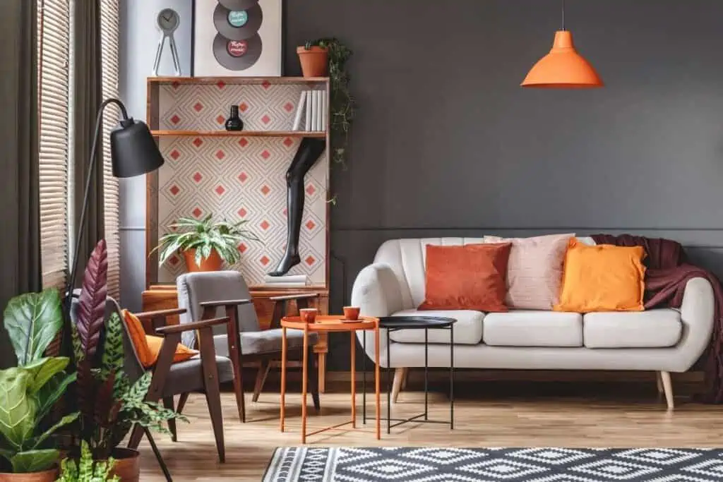
Why it works
- Works well in contemporary spaces
- Grounds bold color choices
- Feels modern and balanced
Burnt Orange & Emerald Green
Emerald green brings in a rich, earthy contrast that feels natural and elegant.
This is a great option for spaces inspired by nature or vintage design.
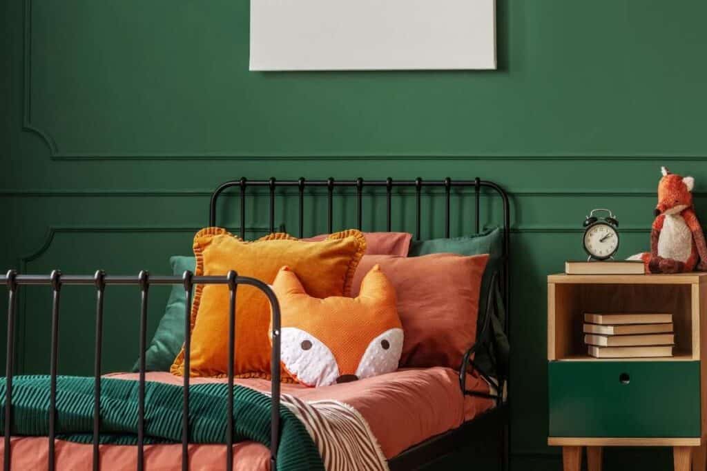
Why it works
- Looks great with brass or wood accents
- Both colors feel deep and grounded
- Adds richness without feeling heavy
Burnt Orange & Black
Black creates a bold, high-contrast look with burnt orange.
The key is using black sparingly so the space doesn’t feel too dark.

Why it works
- Best used in accents or outlines
- Adds drama and definition
- Makes burnt orange pop
Burnt Orange & Sage Green
Sage green is one of the most natural, easygoing colors to pair with burnt orange. It tones down the warmth while keeping the palette soft and livable.
This combo feels calm, earthy, and designer-approved without trying too hard.
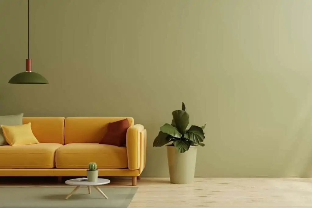
Why it works
- Sage cools down burnt orange’s intensity
- Both colors feel grounded and organic
- Easy to style with wood, linen, and neutral layers
- Works across farmhouse, modern, and transitional homes
Trend Forward Combinations
These palettes are gaining traction in interiors right now:
- Burnt Orange + Navy + Cream – elegant and layered.
- Burnt Orange + Teal – mid-century inspired and bold.
- Burnt Orange + Charcoal Gray + Warm Wood – modern rustic vibe.
- Burnt Orange + Olive Green + Beige – earthy and contemporary
Conclusion
Burnt orange is bold, but it’s also incredibly versatile when paired with the right colors. From soft neutrals to rich greens and deep blues, the right combination can make it feel cozy, modern, or even timeless.
If you’re unsure where to start, anchor your space with neutrals and layer burnt orange in through accents. Small changes go a long way, and you can always build from there.
Save your favorite combos, try one at a time, and keep browsing for more easy, real-home color inspiration.
What Colors Go With Rose Gold Home Decor?